
The importance of colors in the design of modern apartments
How can you keep a room from feeling too overwhelming, boring, or too colorful? We’ve prepared a special infographic that will help you not only better choose colors for yourself, but also for your interior.
How to choose a color palette for your interior?
Gather all the items you want to keep in one place. If that’s not possible, take photos of them all and then put them in one folder. Then, find a common denominator for all the items – for example, each item has a shade of blue. This way, you know which color needs to be included in the new color palette, and therefore, you know where to build.
Get inspired! Choose at least one photo (or more if you like) representing a collection of things you want to keep. Then, upload it to your Pinterest board. The platform will suggest which items are worth selecting and adding to your board. Don’t limit yourself and include anything you like—from a tea mug to a painting. This way, you’ll see the pattern and other colors you like and that complement the overall look. Don’t worry! Your Pinterest board can be hidden, so no one can see your items.
- Think about the mood you want to create in the interior and what you want to feel upon entering the room. Or perhaps what you want other people to feel? It’s worth choosing two or three words that describe the final effect, such as elegant, cozy, or joyful.
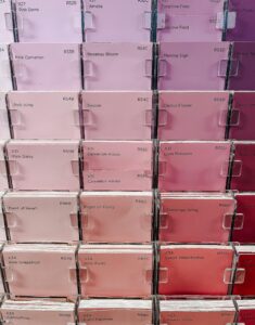
- Choose 3 to 5 colors that appear most frequently in your chosen inspirations and your photos. If you’re having trouble with this, use a color selection tool like Adobe Wheel.
- Choose 2 colors as your base colors. These will serve as a backdrop for all the accessories. They should be relatively natural and not overpowering.
Next, choose complementary colors that will act as accents in your interior. This can be a single color, as in the 60-30-10 rule, or even three colors. It all depends on what colors you like and whether the chosen shades are more vibrant or muted.

The psychology of colors in the interior – what do they mean and how do they affect us?
Did you know that color not only adds character and influences aesthetics, but also affects how you feel in it? Therefore, it’s worth matching it to the room’s purpose.
White has always been associated with innocence and vulnerability, ideal for those working at a computer or mentally. It’s a color that relaxes, calms, and unwinds. It creates a sense of sterility, purity, and spaciousness. It reflects light well, brightening and visually enlarging the interior. It provides an ideal backdrop and highlights other colors. Used excessively, for example, in all rooms, it can create an impression of emptiness and loneliness, and sometimes even coldness.
Black – a deep and elegant color, often used in luxurious bathrooms in combination with gold, for example. Black harmonizes beautifully with natural materials like brick, glass, stone, and wood. It brings peace and calms emotions to a room, but also creates a sense of subtle nonchalance and uniqueness. It’s worth remembering that this color mutes other colors and can diminish a space. A color for decisive individuals and those who want to concentrate better. In excess, it can cause depression and anxiety. Perfect for wardrobes and bedrooms.
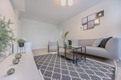
Gray – a neutral, non-invasive color that’s often used to create classic arrangements. It’s calming, complements a variety of colors, and always looks good. In excess, just like white, it can be overwhelming and depressing. Perfect for living rooms, walk-in closets, offices, and hallways.


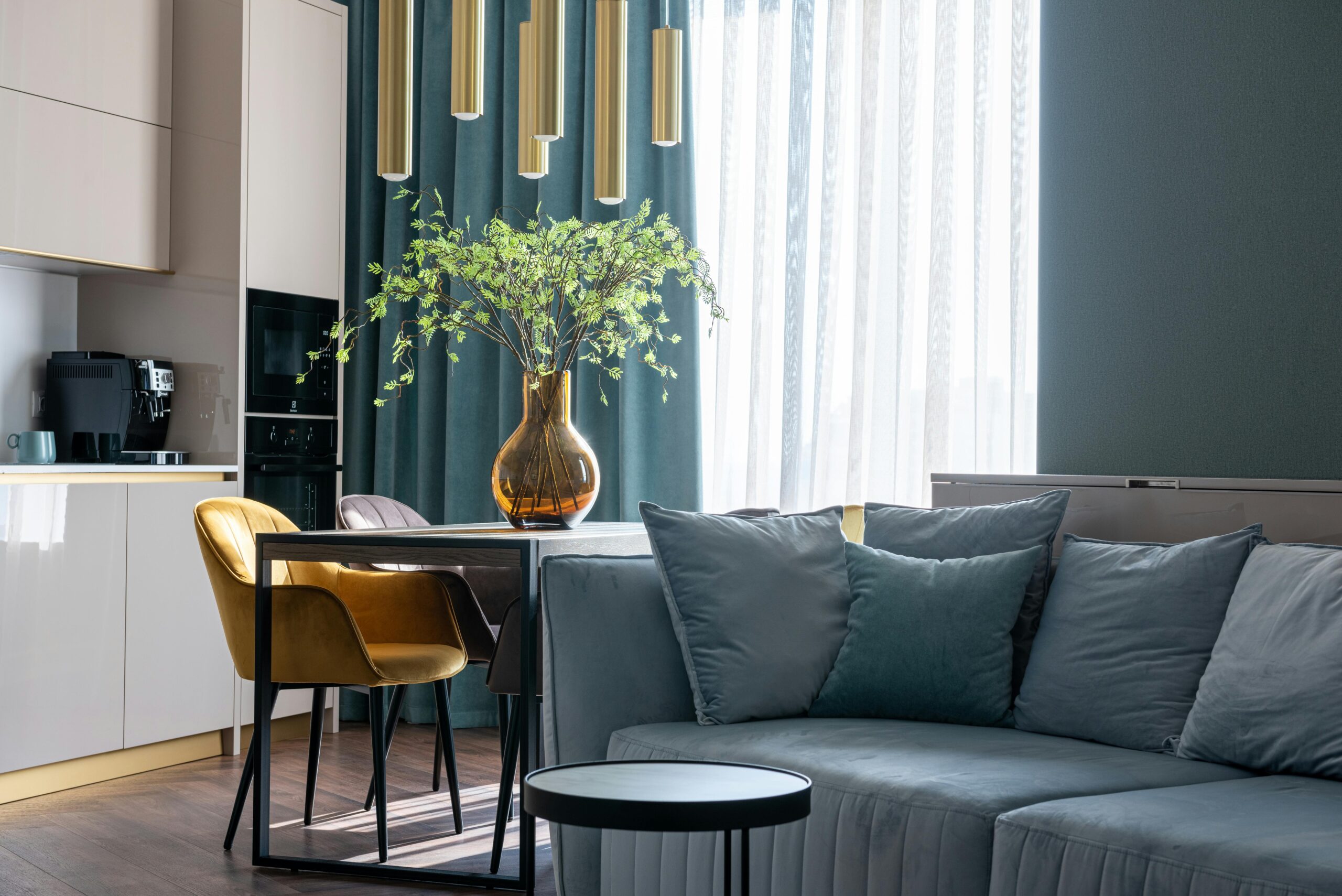
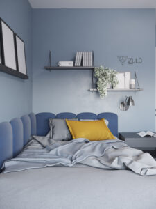
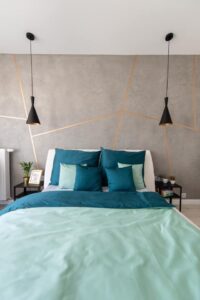
- Blue – when used in light and muted shades, it is a color that will visually enlarge a room. Blue in an interior is very energetic and stimulating, but not overly intense. It improves creativity and concentration, and aids decision-making. It works well in living rooms, bedrooms, and children’s rooms, both on entire walls and on furniture.
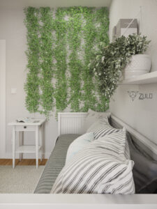
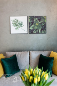
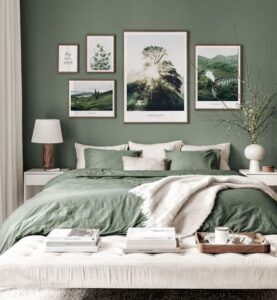
- Green – there is probably no more natural color than green. Used in virtually any shade, it has a calming effect, bringing harmony and nature to the interior. It provides respite, relaxation, and lowers blood pressure and stress levels. Additionally, green has been found to calm, create a sense of space, and reduce tension. Next to white, it is a good color for design, as it has a calming and soothing effect. Too much can be overwhelming, and people in a green room can experience a lack of motivation and passivity. Perfect for living rooms, hallways, and bedrooms.
Brown – another natural color that gives us a sense of stability. Brown is a timeless color. It makes an interior cozy, harmonious, and stylish. When used in a room, it creates an elegant impression without being overpowering. It harmonizes well with natural materials, glass, and provides a good backdrop for plants. It creates a sense of stability and connection with nature. It works well in living rooms, bedrooms, and dressing rooms.
Red – a strong, dominant color, often used to highlight interior accents. Red is a color that provides a lot of energy, attracts attention, and stimulates action. It’s worth remembering that in excess, it becomes too aggressive and can strain not only the eyes but also the entire body. Associated with increased motivation, romanticism, love, and strong emotions and relationships, it works well as accent colors, in accessories, and in the design of bedrooms and living rooms.
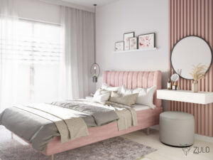
Pink – not just for women and girls’ rooms! Although some shades can be slightly saccharine, pink is a positive color, associated with security, idyllic, and carefreeness. On the one hand, it calms, and on the other, it stimulates action. Pink is primarily associated with a feminine and delicate color, although its muted shades look great in decorations. Perfect for children’s rooms and bedrooms.
- Żółty – Odcień pozytywny, dobry do pokojów dla osób otwartych czy takich, które potrzebują pobudzenia. Świetnie sprawdzi się w kuchni, a w wersji przygaszonej nawet w salonie. Kolor żółty sprzyja spędzaniu wolnego czasu w towarzystwie i zachęca do działania,

And what color is your favorite?